
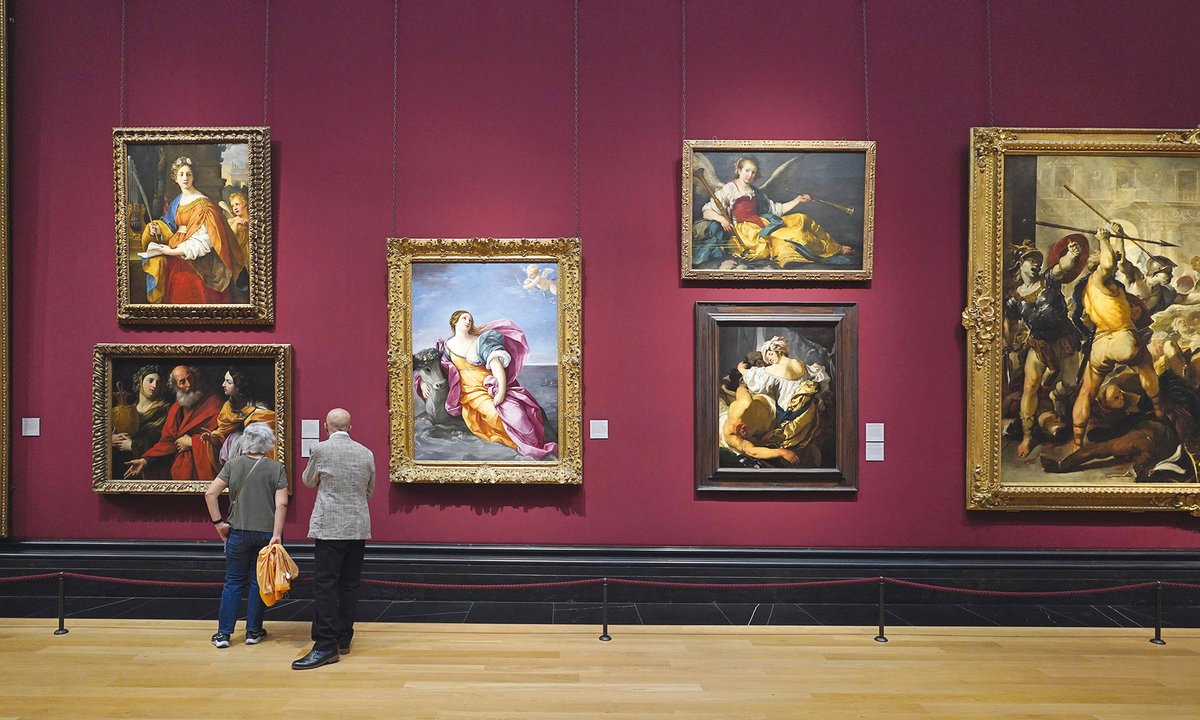
The article explores the often-overlooked significance of color in museum spaces, prompted by a conversation with architect Annabelle Selldorf about her $220 million renovation of New York's Frick Collection. Selldorf describes the new auditorium's muted grey as creating a calm, meditative environment, contrasting sharply with Tate Modern's Starr Cinema, which architect Jacques Herzog painted shocking red to symbolize the space as the museum's "brain." The piece traces historical approaches to gallery wall colors, from Charles Eastlake's advocacy at the National Gallery in London—informed by Goethe's color theory—to the enduring orthodoxy of reds and greens, and a notable departure with deep Prussian blue for a Gainsborough exhibition at Tate Britain. It also recounts Henri Matisse's 1946 project in Paris, where he covered his room's grimy beige walls with cut-paper forms, creating the screens "Océanie, Le Ciel" and "Océanie, La Mer."
This matters because it challenges the assumption that museum wall color is a trivial aesthetic choice, revealing it as a powerful curatorial tool that shapes how audiences perceive and emotionally engage with art. The article underscores a growing awareness among institutions—evident in recent renovations and rehangs—that color can enhance or undermine the viewer's experience, from fostering contemplation to embodying intellectual energy. By linking historical practices, contemporary design decisions, and artistic creation, it argues that color in museum spaces is a deliberate, consequential element of exhibition design that deserves serious consideration.